分类
商品


![[ JS系列5 ] 可选的分号](https://pic.songma.com/wenzhang/20180606/cvzrdb3n0vf4157.jpg "[ JS系列5 ] 可选的分号")


- 商品
- 店铺
- 资讯
 flutter
在 Flutter 世界里一切都是组件,与 Reactive Native 不同是的 Flutter 官方提供丰富的组件。能够满足客户大部分的需求。无需自己来造轮子和引入第三方依赖。
不过无论你的组件库有多么丰富还是无法满足少量特殊需求,遇到特殊需求我们就需要自己写组件—自己设置组件。
今天来体验一下自己写一个 Flutter 组件。
import 'package:flutter/foundation.dart';import 'package:flutter/material.dart';class FancyButton extends StatelessWidget{ }在这里我们除了引用 material.dart 又引用了foundation.dart。我们在基础的组件的基础对其扩展来开发自己的组件。
import 'package:flutter/foundation.dart';import 'package:flutter/material.dart';class FancyButton extends StatelessWidget { FancyButton({@required this.onPressed}); final GestureTapCallback onPressed; @override Widget build(BuildContext context) { // TODO: implement build return null; }}这里定义了一个 FancyButton 扩展了 StatelessWidget Widget,在构造函数需要传入一个 onPressed 方法作为按钮按下的动作。
floatingActionButton: FancyButton( onPressed: () { Navigator.pop(context, 'angularjs'); }, ), // floatingActionButton: FloatingActionButton(onPressed: () { // Navigator.pop(context, 'angularjs'); // }),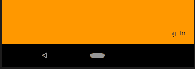 图
图 @override Widget build(BuildContext context) { // TODO: implement build return new RawMaterialButton( fillColor: Colors.deepPurple, splashColor: Colors.blue, child: Text("GOTo"), ); }而后返回 RawMaterialButton 这是一个基础的按钮 Widget 可能没啥样,就是有按下动作吧。
splashColor 按下时候触点泛出波纹效果的颜色
 图
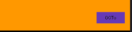
图 @override Widget build(BuildContext context) { // TODO: implement build return new RawMaterialButton( fillColor: Colors.deepPurple, splashColor: Colors.blue, onPressed: onPressed, shape: const StadiumBorder(), child: Text("GOTo", style: TextStyle(color: Colors.white)), ); }TestStyle 指定按钮文字样式
 图
图return new RawMaterialButton( fillColor: Colors.deepPurple, splashColor: Colors.blue, onPressed: onPressed, shape: const StadiumBorder(), child: Padding( padding: const EdgeInsets.symmetric(vertical: 8.0, horizontal: 20.0), child: Row( mainAxisSize: MainAxisSize.min, children: <Widget>[ Icon( Icons.explore, color: Colors.amber, ), const Text("GOTo", style: TextStyle(color: Colors.white)), ],mainAxisSize: MainAxisSize.min 指定按钮包裹内容最小宽度
 图
图 return new RawMaterialButton( fillColor: Colors.deepPurple, splashColor: Colors.blue, onPressed: onPressed, shape: const StadiumBorder(), child: Padding( padding: const EdgeInsets.symmetric(vertical: 8.0, horizontal: 20.0), child: Row( mainAxisSize: MainAxisSize.min, children: <Widget>[ const Icon( Icons.explore, color: Colors.amber, ), const SizedBox( width: 8.0, ), const Text("GOTo", style: TextStyle(color: Colors.white)), ], ))); 图
图SizedBox 作为占位具体
 flutter

送码官方微信


![[SLG/PC+安卓] 龙之女 Daughters of the Dragon v0.194[470MB]](https://img.songma.com/upload/156100/1746426367-156100/0525576001746426398tp156100-1.jpg)


 属性代理商Property Delegates")


 手机访问领取大礼包